Sunday, 18 December 2011

Spink & Ray

Well, Spinks a cat and he started existing a couple of weeks ago when I was sketching a card for my girlfriend.


Spink & friends


I then drew him onto card, coloured, and cut him out. I'm not sure why I enjoy cutting characers out from card so much, I guess its something about being able to give the character physical shape which brings it to life a little bit more. This lil' feller is presently sitting on my computer.


 Spink cut-out


As I fairly recently purchsed a wacom bamboo, I thought I'd make good use of it and give Spink and his new friend Ray some colour. I deffinitely have a lot to learn about digital painting, but I like how it turned out. The font used is antelope h.


Spink the cat & Ray the bird

Sunday, 20 November 2011

BIMA Awards & Graduation

 Myself & Dan on our way to the awards in Fabric
 

Well, this news is a little late, but this month Dan and myself went to London for the BIMA awards, as Octopult was nominated in the Student category. Unfortunately we did not win, but it was a fun night. We met nice people, ate lots of fancy food, and played some games.


This was shortly followed by some accknowledgement for spending a large portion of the past 3 years in front of a computer in various locations within Weymouth house. This came in the form of a graduation ceremony (I'm at 51:20). It was a great finish to a wonderful 3 years and I hope and expect to see many of my fellow BACVA's soon.

wearing fancy robes & throwing hats

Tuesday, 1 November 2011

Lunchometer Is Alive


Lunchometer is a project I was working on during my short but sweet time at Thought Den.
To quote from the Thought Den blog:

Everybody likes lunch, but it’s a minefield out there. What’s needed is an easy method, preferably built in flash and colourised in earthy tones, for rating and sharing your favourite lunch spots.

As the initial concept and technical stuff was already there, it was my job to design the visuals for the application and website and give it some character. I am really proud of it and I hope anyone stumbling across this blog will enjoy it too. Check it out!


This is what it does, cool right!


Monday, 31 October 2011

BIMA Awards 2011 Nomination & Business Card

Well, in a couple of weeks time Dan and myself will be going to the BIMA (British Interactive Media Association) Awards 2011. The reason being that Octopult was nominated for the student award! The Awards will be announced on November 10th.

As this will be a great place to network, I spent today designing an Octopult-y business card to gets myself a job.


I hope you noticed the fancy QR code, which should take you too either the Octopult web page, or my showreel. With the help of Kaywa it took seconds to make. I'm hoping that the size of the QR code doesnt matter, but as it worked for my phone I should be safe.

Get a 10% discount for your moo purchase if you follow this link.

Thursday, 13 October 2011

Cute Monster 2.0 Modeling & UVs

So after putting my character on polycount, I got some feedback about what could be improved. And here is what I have so far.


Cute Monster 2.0 unsmoothed 1527 verts


I was mainly looking at the hands and feet, modelling them so that there would be nice deffinition when smoothed. I also removed unnessecary edgeloops, gave the body and eyes better definiton and changed the proportions of the legs to more resemble the characters arms.

I also gave him a name.....its Alek.


The texture will be symetrical so each half is directly ontop of its opposite side. I put the underside of the carapace segments ontop of eachother as they ideally wont be seen.

 UVs.

Tuesday, 4 October 2011

Cute Monster Textured

It took around 8 hours to unwrap the UV's using UVLayout (not my favourite UV unwrapper, but you cant get Roadkill for Macs, and the demo is free). A further 8 hours to paint the texture.


1k diffuse multiplied with AO from low poly model


textured model (centre 2 are with smoothed mesh)

Thursday, 29 September 2011

Cute Monster Walk Cycle


And after 2 days rigging, weight painting and animating here is a walk cycle for the cute monster.


rigged cute monster 


walk cycle


Tuesday, 27 September 2011

Cute Monster Modeling

After 9 hours a modelling, making it a grand total of 15 hours moving vertices, here is the completed model.


Smoothed and Unsmoothed (about 2200 vertices for unsmoothed)


Foolishly I neglected to to draw the hand in the orthographic drawings. This was swiftly remedied by some observation of my own hands and some quick sketches.


I also had some fun colouring in the orthographic drawings to give me an idea of the colouring of the character for when I reach the texturing stage.


Sunday, 25 September 2011

Cute Monster Concept

So my newest project is to styalize a monster concept into a cute monster. Unfortunately I can't post the original monster concept I am working from, as I dont know who the artist is, and therefore can't credit them.

favorite sketches for "Cute Monster"

   
development of favorite characters


further development of characters


And then refining the concept by taking the cutest character and giving it big eyes. He does look quite sad, but I guess that is quite fitting for a monster trying his hardest to be scary and just ending up being cute


cute (sad) monster rough orthographics


Now its time for Maya!

Friday, 29 July 2011

Lunchometer Animated Header

It was really fun animating the different "idle" animations for luncho. I also got a chance to brush up on some actionscripting for the randomised food and stringing together luncho's actions.


The background is loosely based on nice/eaty places in Bristol

Thursday, 28 July 2011

Dangerball!

Thought Den had an office party last week and I created a dangerball character to go on the invites (dangerball is a staple of these types of events).


For those that don't know, dangerball is any ball game in an office (usually football).


and he has lots of different hats

Wednesday, 13 July 2011

Animation Showreel (July 2011)


A selection of my best animation work to date, mostly from my 3rd year at uni, but a little from 2nd year too.


Roles Breakdown:

OWN LITTLE WORLD (2011)
(4 person group project):
Story
Character development
Boat design
Houdini text
Animation

GODZILLA Vs GLOBAL WARMING (2010) (5 person group project):
Director (inc. art direction, story)
Production

OCTOPULT (2011)
(2 person collaboration):
Art Director (Asset creation and aniamtion)
Game Design

Music is "Gameboy Tune" by Tomas Dvorak

Monday, 4 July 2011

Mini Business cards

So I thought I'd get around to designing some business cards as my degree show is not too far away. The guys at Thought Den got some business cards from moo and, as they looked so nice, I thought I'd give them a try.

It is fairly pricey paying for express delivery (as I had left it so late) but their print quality is really nice, and I am expecting it to be worth it.

These are the designs I've sent off to be printed. Each is a favorite still from one of this years projects.


moo mini cards are 7028mm

I exported the images at 870*378 pixels (as reccomended by moo)


With moo, you can submit any number of images for the front of the cards along with a single image to be on the back of all the cards. Hopefully it isn't too confusing and clearly describes how I can be contacted.


Wednesday, 22 June 2011

Lunchometer In Colour

So here is what I've made so far for the lunchometer project.

colour scheme using kuler


luncho biting

Monday, 20 June 2011

Lunchometer Sketches

This is the start of my 2nd week (of 5) with Thought Den. Thought Den do fun web and mobile and interactive installation stuff. Here is their blog post about me (and other things too of course). Currently, I am doing lots of researching and designing the visuals for a web app going by the name of lunchometer.

header sketch


page layout sketch


animation & icon concepts

Monday, 13 June 2011

Own Little World Release


Own Little World explores the childish nature of imaginary games and a naive perspective of grief and loss.


Final Major Project - NCCA Bournemouth University

Thomas Kelly- Director, Art Direction, Cinematography, Character and Camera Animation, Concept.

Alex Goodfellow- Rigging, Transitions, Character Animation.

Chris Carter- Text development, Character Animation, Story.

Steven Bills- Modeling, Textures, Set Dressing, Rendering, Compositing.

Scott Hazell- Music

Benjamin Riehl- Production Assistant

Film Website: littleworlds.co.uk

Production Blog: ownlittleworldshort.blogspot

Compositing

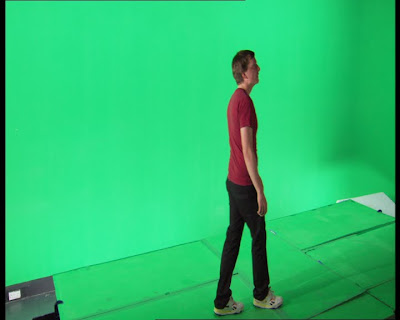
This was an assignment I had in 2nd year. Basically, we had to composit 2 images or sequences together, one of which had to be live action (although they could both be live action).

As I had enjoyed the green screen filming workshops so much, that although I knew it would be a lot more work, I wanted to composit a moving image sequence.

So I went out to get some interesting photographs, making sure to record camera height and map out the light sources so that the exact lighting could be replicated for the green screen shoot. I was looking for a night time, or an indoors location as the lighting would be easier to replicate.


nice background photo I took but didnt use


The shot I decided to go for was one where it looked as though I was walking through a gigantic version of my bedrooom. I then set up my bedroom with appropriate lighting took some shots, and also took some shots with a makeshift chrome ball (an onion wrapped in tinfoil) to help with lighting information.


my bedroom


my bedroom with "chrome ball"

Once the greenscreen studio was set up I realised that it wouldent be physically possible to replicate the shot. This was mainly due to the height the camera would need to be at, and the angle the camera would need to be at to the green screen and stage. So a slightly different shot was shot for the green screen plate.


still from green screen shoot

The still photograph of my bedroom was redone with consideration to light sources and camera distance in the green screen shoot, and also made a little more visually interesting. The image sequence was then composited with the photograph using Shake.


composited sequence


Wednesday, 25 May 2011

Own Little World Finished

My major project this year has been an animated short going by the name of "Own Little World". It explores the wonder of playing and escapism, mixed with a childlike naivety concerning grief and loss.


As we are going to wait a while before we release it online ( film festivals like to be the first place where a film is screened, and we would like to submit it to as many as we can). Here are some stills so that you can get a flavour of it.


I was part of the group of four, the other BACVA students that were involved were: Steven Bills; responsible for modelling, texturing, set dressing, rendering and compositing. Alex Goodfellow; for rigging, animation and transitions. Tom Kelly, the Director; for Art direction, story, effects, cinematography and animation. We also had production help from Benjamin Riehl and our composer Scott Hazell.

My roles were: story, concept art, character development, boat design, text, animation and credits. For a much more extensive breakdown of my work on this project you can check out my major project report. (sorry about the image quality, but thats the only way I could upload such a big .pdf)


littleworlds.co.uk is the animation's site where more information on the film (release and festival dates and the like) and artist bio's can be found.

Tuesday, 17 May 2011

Cast of Octopult

So now I've handed in the last of my coursework, I should have more time to update this with the work I've been doing.

Here is the current supporting cast of octopult:


I just had a lovely weekend in London. Stayed with friends for a long wekend mainly to go to


which I would highly recommend for anyone interested in making games of any type (card, board, roleplay, casual, AAA console). I think they are planning another one for October. But yea, learned loads!