 colour scheme using kuler
Wednesday, 22 June 2011
Lunchometer In Colour
Monday, 20 June 2011
Lunchometer Sketches
This is the start of my 2nd week (of 5) with Thought Den. Thought Den do fun web and mobile and interactive installation stuff. Here is their blog post about me (and other things too of course). Currently, I am doing lots of researching and designing the visuals for a web app going by the name of lunchometer.
Monday, 13 June 2011
Own Little World Release
Own Little World explores the childish nature of imaginary games and a naive perspective of grief and loss.
Final Major Project - NCCA Bournemouth University
Thomas Kelly- Director, Art Direction, Cinematography, Character and Camera Animation, Concept.
Alex Goodfellow- Rigging, Transitions, Character Animation.
Chris Carter- Text development, Character Animation, Story.
Steven Bills- Modeling, Textures, Set Dressing, Rendering, Compositing.
Scott Hazell- Music
Benjamin Riehl- Production Assistant
Film Website: littleworlds.co.uk
Production Blog: ownlittleworldshort.blogspot
Compositing
This was an assignment I had in 2nd year. Basically, we had to composit 2 images or sequences together, one of which had to be live action (although they could both be live action).
As I had enjoyed the green screen filming workshops so much, that although I knew it would be a lot more work, I wanted to composit a moving image sequence.
So I went out to get some interesting photographs, making sure to record camera height and map out the light sources so that the exact lighting could be replicated for the green screen shoot. I was looking for a night time, or an indoors location as the lighting would be easier to replicate.
The shot I decided to go for was one where it looked as though I was walking through a gigantic version of my bedrooom. I then set up my bedroom with appropriate lighting took some shots, and also took some shots with a makeshift chrome ball (an onion wrapped in tinfoil) to help with lighting information.
 my bedroom with "chrome ball"
As I had enjoyed the green screen filming workshops so much, that although I knew it would be a lot more work, I wanted to composit a moving image sequence.
So I went out to get some interesting photographs, making sure to record camera height and map out the light sources so that the exact lighting could be replicated for the green screen shoot. I was looking for a night time, or an indoors location as the lighting would be easier to replicate.
The shot I decided to go for was one where it looked as though I was walking through a gigantic version of my bedrooom. I then set up my bedroom with appropriate lighting took some shots, and also took some shots with a makeshift chrome ball (an onion wrapped in tinfoil) to help with lighting information.
 my bedroom with "chrome ball"
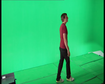
Once the greenscreen studio was set up I realised that it wouldent be physically possible to replicate the shot. This was mainly due to the height the camera would need to be at, and the angle the camera would need to be at to the green screen and stage. So a slightly different shot was shot for the green screen plate.
 still from green screen shoot
 still from green screen shoot
The still photograph of my bedroom was redone with consideration to light sources and camera distance in the green screen shoot, and also made a little more visually interesting. The image sequence was then composited with the photograph using Shake.
composited sequence
composited sequence
Subscribe to:
Comments (Atom)


